
Data Sheet Template Item Reference
This article is a reference for the types of Data Items that are available when creating a Data Sheet Template.
Prior to reading this article, it is recommended that you are familiar with the following Support Centre content:
The following list is a summary of each Template Item type, with a link to the full description in this article:
Header - centred, fixed text that can be used as a separator between other Template Items
Text Field - single line of text
Text Area - text field that can contain a large amount of text
Dropdown - dropdown list from which a single item can be selected
Date - CommTrak date selection field
Checkbox - tick boxes, of which only one can be ticked (sometimes known as radio buttons)
Checkbox (Multi) - tick boxes, of which several can be ticked
File Upload - presents a Choose File button, to enable the user to upload a single file
Statement - left-justified, fixed text intended for presenting a large block of text
The following terminology is used in this reference section:
- Design-time - The time at which the Data Sheet Template is being created or modified
- Run-time - The time at which the user is completing a Data Sheet based on the Data Sheet Template
Each type of Template Item has its own functionality, as described in this section.
Header
Centred, fixed text, typically used as a separator between other Template Items.
Run-time
Example of a Header field, with the label Example Header:

The header text is shown on a background with a darker shade than a standard Data Item field type.
Design-time

The text for the Header must be entered into the blank text field (highlighted red in the above image).
There is no character limit for the Header text.
Text Field
Editable, single-line text field into which the user can type any characters.
Run-time
Example of a Text Field, with the label Job Number:

There is no character limit at run-time.
Design-time

The text for the field label must be entered into the blank text field (highlighted red in the above image).
Text Area
Editable, multi-line text field into which the user can type any characters.
Run-time
Example of a Text Area, with the label Project information (outline):
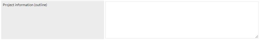
The drag-handle (bottom-right of the above image) can be used to increase the visible size of the Text Area, whilst entering text. This a web browser feature, and may vary depending on which web browser is being used. Dragging the handle does not affect the content of the field.
There is no character limit at run-time.
Design-time

The text for the field label must be entered into the blank text field (highlighted red in the above image).
Dropdown
A dropdown list, from which the user can select a single item.
Run-time
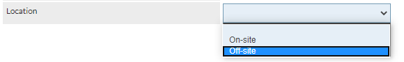
Example of a Dropdown field, with the label Location, and two options; On-site and Off-site:
Design-time

The text for the field label must be entered into the blank text field (highlighted red in the above image).
The second design-time text field should be populated with a comma-separated list of values from which the user can choose at run-time. The following image shows an example of a dropdown field being completed at design-time:

The above example will result in a dropdown list presented to the user, as shown in the dropdown run-time example, above.
Date
A date field, from which the user can select a date using the CommTrak date-selection features.
Run-time
An example of a Date field, with the label Start Date (in this example, the calendar icon has been clicked, but no date has been selected yet):
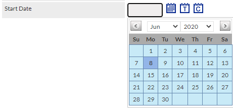
For further information about date selection in CommTrak, see the Support Centre article, Date Selection.
Design-time

The text for the field label must be entered into the blank text field (highlighted red in the above image).
Checkbox
One or more tick boxes, from which the user can select a single item.
Run-time
An example of a Checkbox field, with the label Escalation Level, and three options; Level 1, Level 2, Level 3:
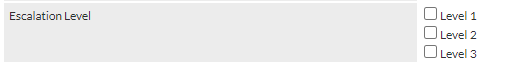
In the above example, an item has not been selected by the user.
The user can select only one of the available options (i.e. only one checkbox item can be ticked).
Design-time

The text for the checkbox label must be entered into the blank text field (highlighted red in the above image).
The second design-time text field should be populated with a comma-separated list of values from which the user can choose at run-time. The following image shows an example of a checkbox field being completed at design-time:

The above example will result in a checkbox list presented to the user, as shown in the checkbox run-time example, above.
Checkbox (Multi)
One or more tick boxes, from which the user can select several items.
Run-time
An example of a Checkbox (Multi) field, with the label Survey Components, and three options; Cabling, Network Points, Telephone Points:
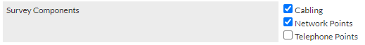
In the above example, two items have been selected by the user.
Design-time

The text for the checkbox (multi) label must be entered into the blank text field (highlighted red in the above image).
The second design-time text field should be populated with a comma-separated list of values from which the user can choose at run-time. The following image shows an example of a checkbox (multi) field being completed at design-time:

The above example will result in a checkbox list presented to the user, as shown in the Checkbox (Multi) run-time example, above.
File Upload
Enables a user to a select a single file to upload from their device.
For security purposes, file uploads are limited to specific file types (e.g. video, image, audio, document). See article, Data Sheet Template Items, File Upload Types, for a list of accepted file types.
Run-time

Clicking the Choose file button will present the device's file browser, enabling the user to select a file. Alternatively, if the device allows drag-and-drop (e.g. Windows), the file can be dropped onto the button.
Once selected, the the file name will be displayed adjacent to the Choose file button:

To replace a previously-selected file, either click the Choose file button, and select a new file, or drag-and-drop a new file onto the button.
Design-time

The text for the file upload label must be entered into the blank text field (highlighted red in the above image).
Statement
Left-justified, fixed text intended for presenting a large block of text to the user.
Run-time
The following example shows a Statement field (starting with the text, Prior to uploading...), immediately followed by a File Upload field. The intention of the statement field, in this example, is to demonstrate how the statement field can contain text, such as instructions, that should be read prior to completing later fields.

The statement text is shown on a background with a darker shade than a standard Data Item field type.
Design-time

The text for the statement must be entered into the blank text field (highlighted red in the above image).